
Software Trial
[ SciRep | Test 1 | Test 3 | Software | Glossary ]
Test 2: GCSE-type data
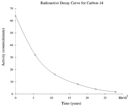
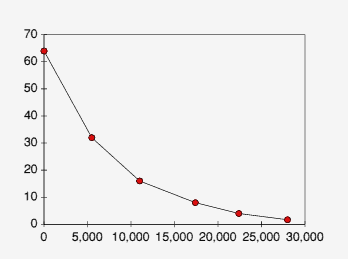
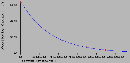
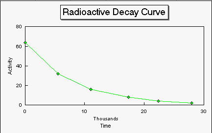
Radioactive decay data is most usefully analysed by producing a graph. The classic result is an exponential decay graph. This should prove interesting!
| Time (hours) | Activity (c.p.m.) |
|---|---|
| 0 | 64 |
| 5500 | 32 |
| 11000 | 16 |
| 17400 | 8 |
| 22400 | 4 |
| 28000 | 1·7 |
Table 2: Radioactive Decay Data for Carbon-14
c.p.m. = counts per minuteThis is how GraphDraw coped with it:
This is how Colton Software's (November 1993!) !Resultz spreadsheet copes with it, after countless menus... that I've now learned. :-)
This is how Insight2 (PC version) coped:
The following graph is how Microsoft Excel coped with it. Interestingly, the y-axis scale has defaulted to a range five times that required to display the data properly! Also, the x-axis is labelled entirely wrongly. This is probably a data selection error when chosing the data to graph. Easily done, I'm sure!
Lastly, this is how Lotus 123 coped with is - note no curve fitting option was available!
Conclusion: Test 2
Exponential decay curves are notoriously difficult to plot accurately. Traditionally, the curve is drawn in one fairly-swift movement of the hand (with a pencil...); and spreadsheets always fail to do anything other than joining up the points!
!GraphDraw has the best features, as fitting a Cubic Spline gives you the opportunity to interpolate (estimate) points on the curve! !Resultz coped badly, as expected. However, export of the DRAWfile would allow us to annotate an exponential curve with a simple Bezier joining the points - highly effective.
The graph produced by Excel (despite needing the grid and legend turned off, and the thickness of curve reduced to make the data points visible!) turns out to be quite good - despite its default range in y being too great, and the x-axis being labelled entirely wrong! Alteration of this setup is no doubt possible, but in exam coursework, this poor job would lose you marks. Lotus 123 fails again without the bestfit option. Instructions on how to do this properly will follow shortly. Notice also that the predicted curve shape at the left is not statistically viable...
Overall, for GCSE it would seem that GraphDraw offers the most appropriate interface for producing high-quality graphs, without the hassle of learning how to use complicated software. It allows easy experimentation with plots, that students will appreciate. And the cost? A snip at £3, shareware! Bravo!
Page design by Andrew P. Harmsworth
Last updated Monday 26th February 2001