 |
Graph Software on-trial[ Main Index | Test 1 | Test 2 | Software | Glossary ] | ||||||||||||||||||||||||||||||||||
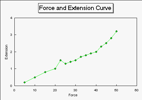
Test 3: A-level type dataFor this test, I have used data from the classic Extension of Copper Wire experiment. (Also called Hooke's Law and Young Modulus experiments). True to form, I have also included a doubtful point to trick the software!
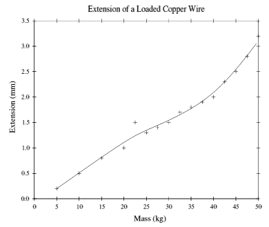
Table 3: The Extension of Copper WireThis is how GraphDraw coped with it:
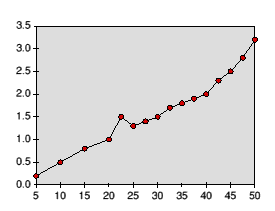
This is how !Resultz copes with it:
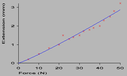
This is how Insight2 (PC version) coped with it:
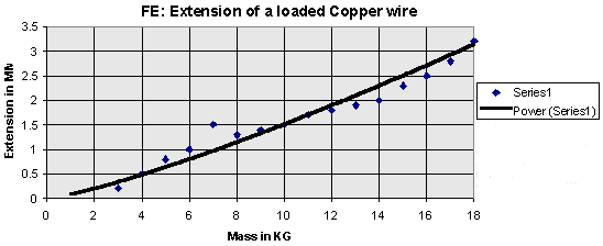
Once again, Excel's graph requires alteration of the width of the bestfit curve (this time a power fit), and the legend can be removed. (N.B. graph drawn by pupil: hence MM and KG should be mm and kg!) Nevertheless, it copes well with the fit, although not with the anomaly. GraphDraw wins again! To be fair, removal of the anomaly would probably produce a better result.
Lastly, this is how Lotus 123 coped with is - note again no curve fitting option was available!
Conclusion: Test 3Data for Force and Extension are frequently used to teach about Hooke's Law, and the Young Modulus for different materials. It is normally first met during GCSE Physics, and at A-level is developed further - introducing the ideas of stress and strain. Data from real-life experiments for this subject tend to follow this classic shape - that of a straight line region (where Hooke's Law is obeyed), followed by a curved region - where permanent deformation of the wire occurs. GraphDraw again manages to handle the data well - especially as I had included an anomalous point! By reducing the strength of the cubic spline fit, the anomaly does not affect the overall shape of the curve. Resultz could have coped with a straight line bestfit, but this would not have ignored the anomaly - giving a large error in the bestfit. Also, this would have ignored the nature of the curve - straight to begin with, then most definitely non-linear. Insight2 again plots the points well, and chooses appropriate scales, but is unable to handle this sort of data. Its curve fitting routines are far better than any of the spreadsheets, but the lack of cubic spline brings failure to this data set. Excel does quite a good job, although I wish it didn't default to using a white board marker as its pen! Lotus 123's looks superior, but isn't - again, no curve fitting of any kind is available Overall, GraphDraw is by far the best software for plotting data at A-level, and its DrawFile output means that appropriate alterations to the final result are easy - with no loss in quality. Formidable!Also of use to A-level scientists is the section on LOG GRAPHS.
| |||||||||||||||||||||||||||||||||||