The Education Bit
Most educationalists would recommend using Spreadsheets for handling
scientific data in schools. This is indeed an important application of IT,
allowing students to experiment with the equations governing their data,
and seeing the effects their changes make. However, this is normally where their
usefulness ends. The final stage of producing graphs is where spreadsheets fail to do justice to the exercise. The expression "a picture says a thousand words" means a great deal here - no matter how good a student's data, the graph is all too important.
Those schools lucky enough to have RISC OS computers can happily make use of a multitude of simple spreadsheets primarily designed for use in schools. What I recommend, though, is that after a student has produced their data, they should export it into GraphDraw to add the ultimate finish to their project - and this last stage takes only a few minutes.
Back to GraphDraw
Now is a good time to point out that GraphDraw is but one
program of a suite: ChartDraw, GraphDraw, MultiPlot, FNPlotter, 3DFNEdit,
Surface & Text>Draw. These cover just about every aspect of
graphing and charting for most users, not just scientists. GraphDraw is a small program - 168K - grabbing only 352K of memory, so it will happily work on older machines, as long as they use RiscOS 3.1 or more.
What GraphDraw Does
The accompanying Impression or Ovation Pro manual is very well written, explaining the technical details of the software. Briefly, GraphDraw is capable of accepting data entry for X and Y, and then fitting these to:
Don't worry if you don't know what all of these choices mean - basically they allow you to choose the line that is drawn through a set of data points on a graph. In reality, you could just go through each option, and decide
yourself which fits the best.
Data Entry
Data can be entered into GraphDraw in two ways: directly into a two-column table, or imported as a CSV file. The latter makes accepting data from spreadsheets or dataloggers easy, although direct data entry is simple enough. For the adventurous, and by default that includes A-level students, it is also able to handle error bars in Y.
A Simple Example
The following is from the original test, and represents a typical experiment that a year 9 pupil would do. A resistor is connected to a variable power supply, and an ammeter and voltmeter are used to measure current and potential difference respectively:
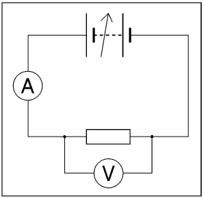
Fig. 1: Typical Resistance Circuit Used in Schools
This was created quickly in !Draw, an often overlooked vector graphics program accompanying every RISC OS computer.
This produces the following as a typical set of results, as entered in GraphDraw:
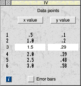
Fig. 2: GraphDraw's Data-Entry Window
Notice the !Help icon available to provide support throughout GraphDraw, and the tick box for Error bars.
From the data entry window the graph can be produced, and manipulated to most suit how we wish the results to be presented.
The GraphDraw Menu
At this stage, clicking MENU brings up the following:
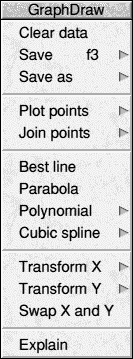
Fig. 3: GraphDraw's Main Menu
Starting at the top, Clear Data does just that; wiping the data entry window. Usefully, it does warn you by asking if you really want to do this!
Save saves a CSV-like
data file, but in addition to the data the title and axis labels of the
graph are included. As always, the standard F3 function key calls up the standard save dialogue box.
Save as gives you three options: Text file of the raw data (as CSV), CSV, and TabSV.
Plot points gives you four options on how you want your data
plotted: Normal, Semilog X, Semilog Y, and Log-Log. Usefully, you can
interchange between axis styles at any time. For GCSE studies, we need only concern ourselves with
Normal; only at A-level
(and then rarely, these days) do we need to worry about logs.
Join points offers the same four options, but rather obviously joins the points together, instead of producing a scatter graph.
The next four options, Best line, Parabola, Polynomial and Cubic spline, are the most powerful features of GraphDraw. They allow mathematically-accurate plots of lines through your data points; essential tools for producing correct graphs.
The final three options, Transform X, Transform Y,
Swap X and Y, allow rather useful manipulation of the data as entered. The two Transform options allow mathematical functions to be applied to the relevant data set: Log, LN, EXP, Reciprocal, Square, and Square root. Swap X and Y
simply swaps corresponding values in X for Y. This is phenomenally useful if
you have exported your data from a spreadsheet, but had generated it the
wrong way around - or if you entered the data by hand wrongly.
Adaptable Graphing
A Normal plot of the points produces the following graph:
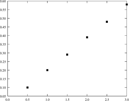
Fig. 4: Basic Plot of our Data
This in itself is obviously not what we want. We must:
- label the axes, including units
- add a title
- add a bestfit line
- perhaps alter the scale and change the point type
This is, of course, easily done! Two simple menus can yield stunning results. The first of these is the Graph Legend:
|
|
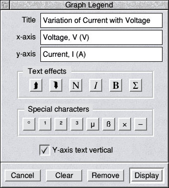
Fig. 5: GraphDraw's Legend Window
Notice the Text effects that are available for producing superscripts, etc. Standard special characters are supported, but this menu is customisable if you need more - or you can enter from !Chars, or similar.
These few additions add all the text we require. For the bestfit line, we need to go back to the main menu, and select Best line. This calls up an information window, with excellent statistical analysis of the bestfit line:
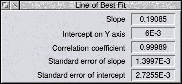
Fig. 6: Bestfit Statistics Window
Notice that it automatically calculates gradient and intercepts! The correlation result is also useful - it tells you how well the line fits the data.
Clicking MENU over this window allows you to save the line of bestfit
data, or print it, and allows you to choose whether you want the line added
to the graph.
Lastly, we may want the origin to be visible, and this feature is changed through the Graph Layout window:
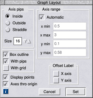
Fig. 7: The Graph Layout Window
This offers amazing attention to detail, with unparalleled ease of use.
Starting with the Axis pips, my personal preference is for them to Straddle the axes. Even their size is adjustable! Axis range allows the precise setting-up of the axes. Even left on Automatic, it produces a decent set of axes. Compare this to mega-programs, like Microsoft Excel that frequently set entirely inappropriate axes!
Three more options switch on or off the Box outline, Axis pips and whether there is a grid; which can be useful. Offset label determines whether the axis labels are offset to the side, otherwise they default to the middle.
Et Voilà!
Finally we have a perfect graph, reproduced smaller than one would want here. The DrawFile format means that it can be scaled in DTP packages without any loss in quality. Ah, the joys of a well-designed OS!
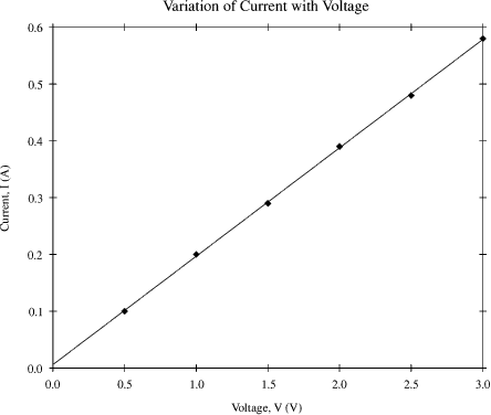
Fig. 8: Final Annotated Graph
The DrawFile output has been converted for use on the WWW, and anti-aliased, using Peter Hartley's InterGif utility.
And There's More!
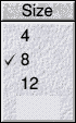
 Fig. 9a/b: Size and Symbol Menus Respectively
So far, everything we have seen is more than adequate for even advanced
graph users. However, there are many more features that I have not
mentioned. Firstly, you may have noticed a subtle change in the style of the
points on the graph. On the left is the size menu. On the right,
we have all the combinations of point type available. Changing the style of
a set of points is useful, especially when you want to add more than one set
of data to a graph.
Analysing Errors
At A-level and above, analysis of errors, or perhaps we should call them
uncertainties, is all important. This is fully supported, and it even
offers the quick route of percentages if precision is not your game.
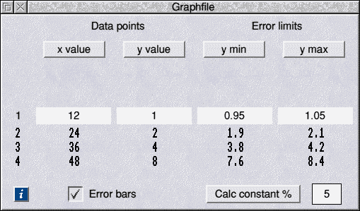
Fig. 10: Extended Data-Entry Window
Enter a percentage, and click Calc constant %, for the easiest
uncertainties yet!
Alternatively, if you want to use uncertainties calculated from your
experiment, these can be manually entered. Uncertainties can only be used
for Y-axis data. Should your uncertainties be in X, then use the Swap X and Y option from the main menu.
Multiplot
GraphDraw cannot directly handle more than one set of data at a time. However, a second small application that accompanies it, !Multiplot, is able to receive directly exported data from it. This is where the alterations to the data point style are useful. Nevertheless, Multiplot itself can alter the styles if points and lines - and then add a legend to the graph. I won’t review it here, but suffice it to say that it will do everything one could wish for!
Make it Pretty!
Spreadsheets will tend to produce wonderfully colourful graphs, that really make good use of today's colour printer technologies. It is just a shame that the graphs themselves are terrible. GraphDraw itself cannot produce coloured output - but the file format allows for infinitely-complex editing.
Loading the graph into Draw, you can select lines or points individually, and change their colour. You can select titles, and alter fonts and sizes. You can do whatever you want!
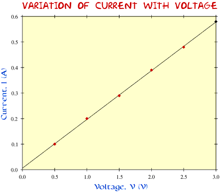
Fig 11: A Colourful Graph - just like Excel!
I know, it is disgusting - but it shows what you can get up to with Draw,
if you really want to.
Conclusions
As I said at the start, this is one powerful beast of a graphing program, that looks deceptively simple, thanks mainly to its well-designed user interface. The fact that it is freeware is incredible - no science department or science student should do without it.
Download GraphDraw Now
If you find it useful, please tell the author!
|