
Graphs

[ Home | Wordprocessors | Desktop Publishers | Spreadsheets & Tables | Equations ]
Graphs are very important in science, although it is often possible to create far too many of them with your computer. As a general rule, decide what you want the graph to show, before trying to create it. Spreadsheets can easily be used to create graphs. The following is a graph of Power against Voltage:
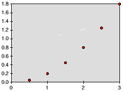
Unlabelled scatter graph
- A title, briefly stating what it shows.
- Correctly labelled axes, including the units.
- A hand-drawn line through the points. In this case, a smooth curve. Sometimes a best fit line should be drawn. Never join the points up with a zig-zag! Specialised software will allow you to fit a curve through the data points; spreadsheets will not.
The graph should be large. Although using the computer will increase the accuracy of the plotted points, you may need to read information from it. In other words, it should be as big as it would have been had you plotted it by hand. For simple graphs, A5 is acceptable. Anything complicated should fill an A4 page.
Generally, we tend to use line graphs (i.e. single points plotted on a graph, with an appropriate line through them) more than any other. In addition to the title, a graph and table could also have a table or figure number, respectively. When referring to either in the text of your write up, it is better to talk about graph number, rather than the graph overleaf. By the time you have finished your write up ready for printing, the graph or table may have moved. Equally, this rule can be applied to equations. This is a small point, yet it adds a professional touch to your project that will be appreciated by the assesor.
With a little effort, the graph can be labelled, boxed (if small) and titled (fig. 1).
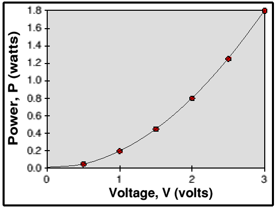
Figure 1: A Graph Showing the Variation of Power with Voltage
If you want to fit a curve through points, but don't want to do this by hand after you have printed, one way is through the use of Bezier curves. In fig. 1, I have overlayed a simple Bezier curve through the points, which took 30 seconds in Draw, a free program on all RISC OS machines.
MORE: Graphing Details - logs, paper, software!
NEXT: Equations
[ Home | Wordprocessors | Desktop Publishers | Spreadsheets & Tables | Equations ]
If you would like to make comments or suggestions about these pages,
please feel free to contact the author.
Last updated Friday 23rd February 2001 | Top ^^